Sunday, March 26, 2023

Digital Art Practice (Week 25)

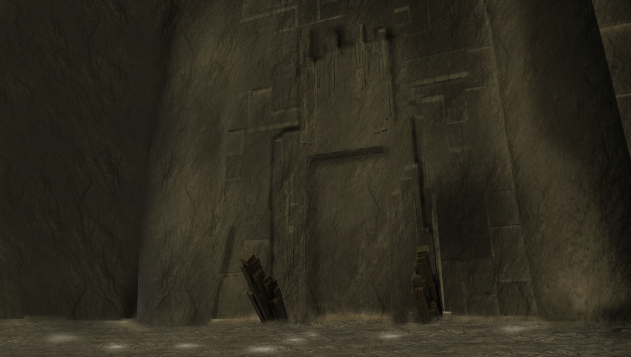
This week I wanted to focus on finishing the photobash for my final concept.

I took on some advice given to me by Craig, where I implemented some design choices to fit in with this snake design. One of the design choices was to make extra cracks in the rocks so the snake was able to slither.

As a stylistic choice, having a rock snake fit in with the boss arena nicely - however some oversights were, on the original design I wanted it to transform into a dragon as the level progressed, however, it was confusing to understand how to fit the anatomy (the wings and legs) inside the rocks without getting a different looking snake, so in the end I decided to scrap this part. But believe a snake for the level still works well, considering all the motifs inside the boss arena.


Thursday, March 9, 2023

Digital art practice (Week 23)

This week I wanted to focus on enhancing some of my work - by incorporating different ways of iterating/designing.

The idea behind me doing 3/4 view of the snake head was to help understand form. Whereas orthographic views I have previously done are a good way to help shape definition, doing it this way helps me continue iterating but also understand the process in a 3 dimensional space.


Thursday, February 23, 2023

Digital art practice (Week 21)

Coming off of last week's work, I thought it would be fitting to start experimenting with different ideas and ideations.

So I started off by creating the tails in a more realised format, as well as starting on silhouettes for the head - giving it interesting shape language such as spikes, lumps and bumps to help give the snake a more 'rocky form'.


Thursday, February 16, 2023

Digital art practice (Week 20)

This week I wanted to start focusing on the boss creature.

As mentioned in a previous boss arena section, I wanted my boss to be based off of a serpent type creature, this will fit into the environment by having a rock spine which would blend in with the surroundings.

The main focus however was on the tail, I wanted to see what tail would fit most with the overall theme, I am leaning towards a rocky tail, because then this would look like a stack of stones on top of one another, making it work for the arena - but I did go over other designs for what could work in this setting.


Thursday, February 9, 2023

Digital art practice (Week 19)

This week's focus was on finalising how the scene would look compiled together.

The lighting and textures work well in this piece, giving the viewer of how the arena is going to look.

With the addition of leading lines that guide the viewers attention, to date, this is one of the strongest pieces for the boss arena project.

I tried to implement various things to imply what the boss creature could be, such as carved rock snakes climbing up the pillars and the ouroboros on the door.

To achieve the final result, I sourced varying rock textures as well as used the lines I already made on the 3D model to add the lighting/emissive effect, then to finalise I added a character for scale.

Baseplate captured in unreal


Sunday, January 29, 2023

Digital art practice (Week 18)

This week's focus was on creating functional mechanics for the boss arena project.

I was thinking of doing a health bar system for the level, but making sure it wouldn't clutter up the UI.

So I thought about having a bar that soaks into the wall and door, which fills up as the boss' health depleted, having this would make not only for a cool level effect, but would serve as to not distract from the main event in the form of having obscuring UI on top.


Thursday, January 26, 2023

Digital art practice (Week 17)

This week's focus was completing my hero asset.

Going along with the shape language I have in my baseplate/3d blockout, It was more than fitting to go with the square options - almost like a sub story could be that each height of the pillar represents the steps to a higher plane, which links in to my theme 'godsend'.

Overall, I like the texturing and especially the emissive work that I put into the final renders.


Thursday, January 19, 2023

Digital art practice (Week 16)

This week's focus was on greyboxing my scene and putting it within unreal.

The general thing I wanted to do was understand the level layout and functional mechanics of the level - I drew inspiration from Dark souls and Elden Ring for my room.

These type of boss arenas are relatively big and have a centralised boss so it does not distract the player by looking at the level.

Having large architectural statements like the pillars and door which help exemplify the scale of the level and justifies the scale of the boss, furthermore, having a character put into this scene would also justify the scale.

I mainly wanted to go with square and circular shapes for the room but more jagged and organic shapes for the boss in order to contrast one with the other.

Unreal screenshot


Baseplate


Greybox


Thursday, January 12, 2023

Digital art practice (Week 15)

This week, we started our boss arena project.

I had a few ideas, but mainly wanted to focus on more organic objects. Original ideas stemmed from having a throne room to a void with pillars, but I decided to go with my rock/crystal cave, mainly because I thought it would be good to get nice shape language and work on material callouts for this specific outcome.

I gathered reference for various games, I wanted my arena to fit in with the theme of Dark Souls/Elden ring and Shadow of the colossus. Having a singled out area that has a lot of attention to detail and retains a visually appealing scene.


Friday, December 16, 2022

Apocalyptic Vehicle project postmortem

 This blog update is reflection on my apocalyptic vehicle.

Overall, this has been the strongest project this term in digital - I felt a lot more in my comfort zone and knowing I have the capability to understand perspective well to correctly implement photobashing techniques.

Although I didn't use an awful lot of photobashing, more brush work, the project turned out really strong, incorporating effects such as lighting passes and correctly drawn graffiti.

There were many strong elements to the work, the presentation, material and decal callouts and overall look of the vehicle - however, If I were to take anything from this project, it is to not stop at a point and consider the work to be finished, with additional feedback, you can keep working on a piece to improve it and this will most certainly have a positive impact like it did with mine.

I would never have considered adding all the graffiti and emissive traits on my car if I hadn't followed through with feedback prompts.


Insect character project post mortem

This blog update is reflection on my insect project.

Overall, this project was a good way to introduce myself to photobashing.

However, it has been a challenge to complete it due to characters not being my strongest form of art, furthermore, trying to find a base to work on to help start the photobash was difficult. The difficulty arose when trying to find certain models with the right build for the theme I was going for, I think it might have been easier to make a sculpt to photobash in top of, but this could have gone either way.

A strong part of this project was giving clear material callouts, which would be useful for any 3D artist. But going forward, I want to make sure I can gather good high quality reference and try practicing more material rendering to paint over seams and deliver better looking values and high detailed areas.


Thursday, December 1, 2022

Digital art practice (Week 9)

After finishing my main vehicle concept exterior, I thought it would be good to make up a quick concept for the interior, just as a way to show off how it could potentially look.

One thing I though that fitted very well with the theme was the steering wheel.

It is neon green and from one angle it is shaped like a nuclear symbol, but when upside down it is shaped like the peace symbol, the duality of this theme adds a deeper meaning to the car.

I decided to only do 1 seat, mainly because it gives the ability to see what one slot of the car looks like, then you could replicate this theme for all the other seats as well.


Wednesday, November 23, 2022

Digital art practice (Week 8)

This week's focus was adding to my photoshop file, adding various bits to make it more photobash like.

After taking onboard feedback from peers and tutors alike, where I last left off, the piece was quite sparse and needed some attention, so to fit with the theme that I laid out at the start of the project, I thought it would be fitting to add more decals to the car in order to aid the narrative development.

Furthermore, to not waste space on my presentation sheet, I thought it would be best to add additional decal and material callouts in order to fill out the space.

This has been very effective to help lift out the project and make it more about concepting rather than illustration.

Another thing I added in order to boost the project was callouts for emissive features, such as the neon paint on the pipes or the exhaust flames, this would give a 3D artist something to work from and makes material readability easier.


Sunday, November 20, 2022

Digital art practice Self Directed (Week 8)

This self directed was focused on presentation and picking out key pieces of making a good presentation.

When looking at presentation for items, I normally saw the consistency of the grey gradient background. Normally this is accompanied by some sort of frame or bounding box. As you can see in the example below from Andrew Menjivar, there is a clear bounding box that incorporates breathing room into the work..

Furthermore, it is apparent that a lot of the concepts have a logo to go along with it, normally to show it is a part of the world building, but also possibly to demonstrate that you are competent at making graphics as well as the concept, as they both run concurrently.

Overall, the main takeaways for presentation is to have cohesiveness to all of the work, including the same background, consistent palette for the text and frames.

https://www.artstation.com/artwork/B38Nrl


Thursday, November 17, 2022

Digital art practice (Week 7)

This week's job was to focus on the basic texturing of the 3D within substance painter.

I also wanted to focus on making sure I chose my colour scheme and applied it within painter.

My main process was modelling the car with 3ds max, then exploding the UVs. When importing to substance, I baked down a turbosmoothed model and made an 8k texture, as to ensure I could get the best possible outcome from the painting of the car.

Furthermore, I wanted to establish my presentation look for the car within photoshop, ensuring it gives as much information to a 3D artist as possible.

As a final pass, I put it through marmoset toolbag to ensure I had the best possibly lighting, with the addition of adding effects such as ambient occlusion and post processes. to enhance the image.

Substance painter texture


Presentation in photoshop


Tuesday, November 15, 2022

Digital art practice Self Directed (Week 7)

This week's self directed is focused on generating colour schemes for my vehicle, some are quite tame, where as others are very outlandish.

Some colours are symbolic of the theme I was going for. Such as, the red and cream, which denotes a retro looking object, which would fit quite nicely with the 'new old' theme I wanted my vehicle to be based on. Furthermore, the red and yellow scheme was based off the idea of a 'hot rod' representing the flame of the car, but overall this scheme was a bit too powerful for the tone and atmosphere the car is linked to.

The muted tones work better, my personal favourite is the desert tan and olive drab car at the bottom left of the picture, because it has a militaristic colour scheme while also acting as 'camouflage' and giving off a more serious tone to the situation. Though other colour schemes reflected a more over the top tone which would be perfect for the context, using these colour schemes would de-grade the integrity of how the car would look in the final piece, ultimately discarding the more over the top ideas.


Thursday, November 10, 2022

Digital art practice (Enhancement week) (Week 6)

This week I wanted to focus on creating my vehicle for the project.

Craig said it would be alright to use 3D as a base in order to help the process, given that I am quite proficient in 3D, I took the opportunity to create the vehicle.

I believe the car has quite a good shape language dynamic. The plow at the front, very triangular with the neutral square/cube shapes all across the car shows a menacing looking vehicle. In addition, the symmetry of the car helps break up the silhouette, such as the boxes on top of the car and the exhaust pipes. It looks very makeshift and is a good start to this project.

It looks like the reference I looked at, although a very futuristic version of the cars, as dictated by the shape language.

It is my intention to explode the Uvs and do an 8K or 4K texture paint in substance painter to get a base for the car to help aid the texturing process.


Monday, November 7, 2022

Digital art practice self directed (Enhancement week) (Week 6)

This week for self directed I wanted to gather some reference for style I wanted to go for in terms of my vehicle.

in the context of last week's post, I wanted a run down society where anarchy is rampant, people steal, vandalise and do other sorts of crime to get by.

When doing research for styles I wanted to go for, I looked at Rage as my reference.

It is exactly the style I was thinking of in terms of the context at hand.

It's a way to get some colour schemes established as well as thinking of slogans and ways I could cover the car with decals.


Thursday, November 3, 2022

Digital art practice (Week 5)

This week for digital art practice we have officially been given the post apocalyptic vehicle brief.

My style was to go with the idea of mad max - post apocalyptic style.

I thought of the idea of having a group of people taking drugs for pleasure but end up becoming anarcistic in nature, turning to violence, vandalism and other crimes.

This reflects in the world building and how the car would look in context.

The world is an every man for himself kind of world, so this would reflect int he vehicle design as the protagonist would also indulge in the anarchist type of behaviour.


Wednesday, November 2, 2022

Digital art practice self directed (Week 5)

This week, I wanted to do some preparation for placements.

For this self directed task, I wanted to do some exploration with different styles, this specific style, tailored towards Rare.

Following procedure with previous projects, iterating, colour and render, it is my intention to take this to 3D once I have fully finished with the concept sheet.

I decided it would be worth putting extra callouts on the design, such as emissive traits, then it would show I am capable of making coherent designs and giving useful callouts which could be used by a 3D artist.


Saturday, October 29, 2022

Digital art practice self directed (Week 4)

This week I wanted to do an analysis of photbash/painting to help me understand the process for the vehicle project.

On this piece you can see that the wheels could be made in 3D to get general perspective, but in the case of this project, there has been photo reference, everything else had been painted over to create the painterly effect. Most notable is next to the front wheel on the ground, where you can see the square marks where the artist has used brushes to define shape.

Overall this piece has a very square shape language, along with circular wheels, creating welcoming harmony, vs say triangular shapes to create an unnerving opposite.

All colours are fairly washed out, possibly to represent the idea of a post apocalyptic style where materials would be scratched and damaged.


https://www.artstation.com/artwork/r0Oda

Thursday, October 27, 2022

Digital art practice (Week 4)

For this week's digital art practice (we did not have any lessons for this week due to us using the drawing centre) However, despite this, I carried on with self directed.

This week I wanted to focus on getting reference for the vehicle project.

I had a rough idea of how I wanted my car to look, I wanted to go with a vintage style, but with a modern interpretation, that way it has stylistic value. Such as the case with steam punk or diesel punk. It can incorporate modern technology with that defined art style.

Furthermore, through personal studies, I looked at Mad Max and Junkertown from overwatch to look at a post apocalyptic style. Although, it would seem pretty generic looking at these sorts of references, it is about the execution of how I end up doing the design that matters.


Thursday, October 20, 2022

Digital art practice (Week 3)

This week, I wanted to finalise my project and ask for feedback on my work.

A neat idea Craig recommended was my character to have a pattern on the fabric to add some breakup and to take your eye away from that area.

Additionally, to have some iridescence on the shells/armour pieces.

Furthermore, he recommended I add some extra functionality to the pieces, for example making the belts on the back view functional. Rather than making a belt pull-over, have the belts detachable.

Design with callouts.


In addition to this process, I made it a priority to do my colour experimentation.

I ended up going with the above colour scheme, because it seemed to reflect insects very well, such as green of caterpillars, the grey hue of beetle shells and the previously mentioned iridescence.

The colour schemes were all contrasting colours, just for variety and experimentation, but I wanted my choice to be logical, it may have been nice to have a red bug carapace as armour, but it just wouldn't look realistic in this context so I discounted all the colour choices I came up with.


Wednesday, October 19, 2022

Digital art practice self directed (Week 3)

For this week's self directed task, I wanted to analyse a character concept by concept artist Daryl Tan.

I chose his art 'Kylie Kix' as my point of reference.

Link to the reference - https://www.artstation.com/artwork/d0o6Ne

The concept is well broken down into steps, including, sketch, refinement, value pass, colour pass, render.

There is clear use of contrasting colours, in this case it is purple and yellow.

Furthermore, the principle of colour picking off greyscale colours, like warm and cooler greys, rather than pure black and whites. The grey is colour picked from around the blue-purple range and the pink represents a slight offset to the purple, so overall the colour scheme feels harmonic.

Typically, line art isn't always pure black either, and sometimes you could create a masked area and paint over the line in a darker or lighter tone of the colour the line is over, so for example, if the line is over a highlighted blue area, you could paint the line a light blue

This may not help directly with photobashing, however, this gives an insight into how colour theory works, if your photobash isn't particularly great, good line art and basic colour rendering could be something to fall back on.


Thursday, October 13, 2022

Digital art practice (Week 2)

This week, there has been a slight change of pace, after investing into different ideas to branch out my design theory - I encountered a design I really liked, however, this has diverged from the main ancient egyptian theme I was originally going for.

However, this new design I made works really well. It consists of a symbiotic bug/alien like arm that grows green fungal pods on it, like a virus for the host.

The thing I am finding most difficult with this project is trying to expand my design thinking to fit in with the theme I am going for, without detracting from the project or making my decisions too outlandish.

For the design, I kept in mind various effects that would work for a 3D artist, such as emissive traits, bounce light/material properties, the effects I added could also help a tech/vfx artist with the project.


Wednesday, October 12, 2022

Digital art practice self directed (Week 1)

This week I wanted to create more sketches and input local values.

I branched out from my Ancient Egyptian theme a bit, this was in order to assure I could get more designs down for the character.

In this scenario, I could imagine the various armour pieces are from a fantasy version with giant bugs/insects and are being used as a trophy by the wearer for slaying them.

In general, now I have incorporated new features to the designs, they look a lot more appealing - using various shape languages, mainly circular and triangular to convey the danger of these insects, additionally, real life reference for insects conveys similar shape language, normally to ward off predators.

The local value I used helps the user identify the material, such as specked/striped white materials representing metallic objects and darker objects representing more rough organic objects. In turn, this will make reference gathering easier as I know what to look for when getting photos to use.

For example, knowing the darker value of some armour could mean I look for a darker bug carapace that does not reflect light.


Friday, October 7, 2022

Digital art practice self directed (Week 1)

 This week, I wanted to look into additional design ideas for my insect.

I thought about incorporating other ideas like wings depicted in ancient Egyptian murals for scarab beetles.

That way I could affect the silhouette of the character and incorporate other insects like a butterfly - additionally having a gold crown in the style of the sun would be some good iconography to include. 

The purpose of this research was to boost idea generation for ideas I could include on future iteration, the issue I may come across is resourcing the correct images for photobashing.


Thursday, October 6, 2022

Digital art practice (Week 1)

This week, we were given the brief for our photbashing project.

I had an idea for what I wanted to do, my idea is based off the the mythos of ancient Egypt and the idea of scarab beetles - however it is my intention to incorporate other insects I see fit, such as a cicada or monarch butterfly.

Some roadblocks I have hit so far is not understanding some things I would like to put in, for example, I would really like to make a design for a helmet, but I have not find any reference for 'organic helmet' only hard surface, which makes it difficult to make a good looking character based on the searches I have made.

Another issue is branching out into varying designs for this. I want to keep it as authentic as possible in order to match with the time period while also making it seem believable, because some ideas I have had would not fit in the scene due to it either not being overly historically accurate or not being functional for the time. i.e: you wouldn't find dieselpunk or sci-fi stuff in ancient Egypt.

Given my subject matter, doing varying colour schemes will also be a challenge, however, I will experiment like last year and see what could work with the designs.

Stylistic choices - ranging from in game aspects and other varieties of informed choices

All photo resources for idea generation